I’ve been making maps for a couple of years now, but I’ve yet to share one on Post Irony. The main reason for that is I don’t have a lot of cartographically attractive maps in my portfolio. My earliest efforts are quite ugly and in the two jobs I’ve held in the GIS field I haven’t really been called on much to make full-on cartographic products. It’s been mostly analysis and tweaking other people’s maps.
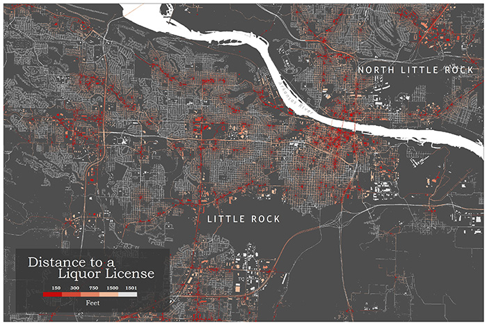
Back in the summer I came across a post on a Boston-based cartography blog describing the mapping of bars in Boston. I thought that would be a neat thing to do for Arkansas, and I could use it in an upcoming GIS class I was taking in the fall. I called up the Arkansas Alcoholic Beverage Control and got a spreadsheet of all the alcohol-license locations in the state. Then I mapped them by address.
If you clicked the link for Bostonography, you probably noticed that I totally ripped those guys off with my map design (Click on the map and you can see it much bigger. You can find your house if you live in Little Rock/North Little Rock.) One difference is that I mapped all alcohol permits and Bostonography mapped only bars. Their map is really cool looking and I wanted to see if I could reverse engineer it. But I didn’t stop with that map. For my class I knew I’d have to do at least a little deeper analysis. I decided to see if there is a reason the liquor licenses are located where they are. More specifically, I wanted to find out if poor parts of Pulaski County have disproportionately more places to buy alcohol. I took a spatial statistics class last spring so I knew this kind of thing could be done. Also I figured (correctly as it turned out) that this exact analysis had been done in other parts of the country. In some large urban areas it has been statistically shown that alcohol-sales locations and median household income are correlated. Meaning poor areas have more alcohol-sales outlets. Making this whole ordeal easier was that the mapping software has statistical-analysis functionality. All you have to do is figure out what stat you want to look at and how to interpret it and then it’s plug and chug.
Unfortunately this kind of analysis often results in dull maps like these:
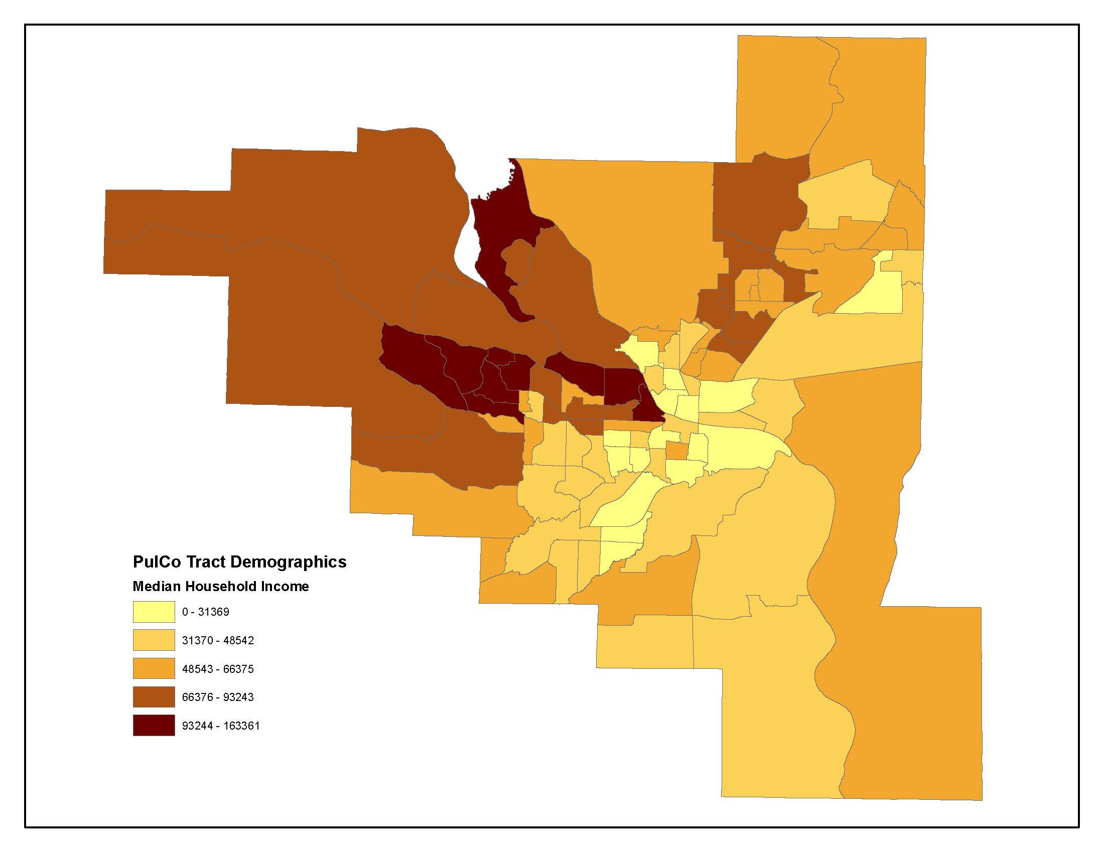
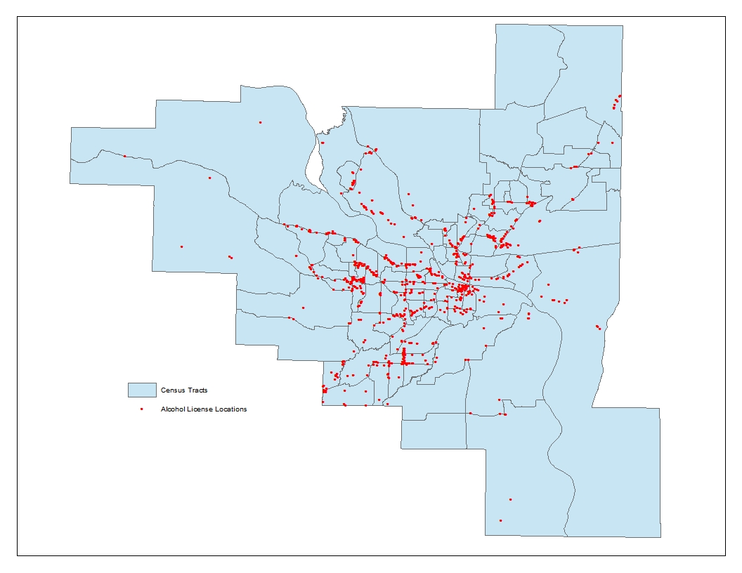
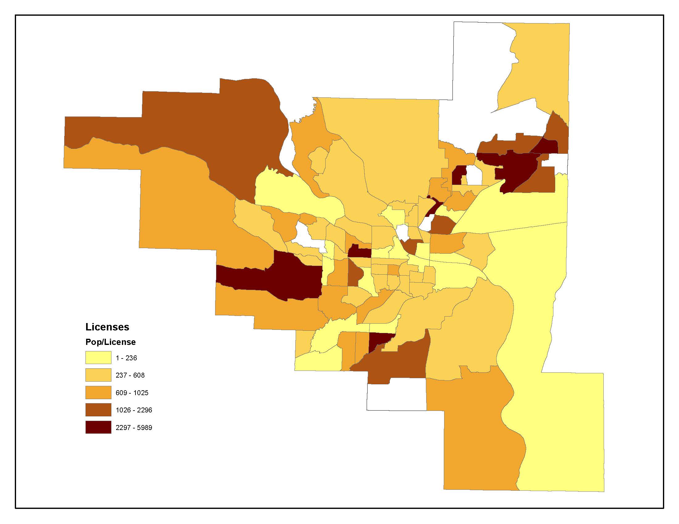
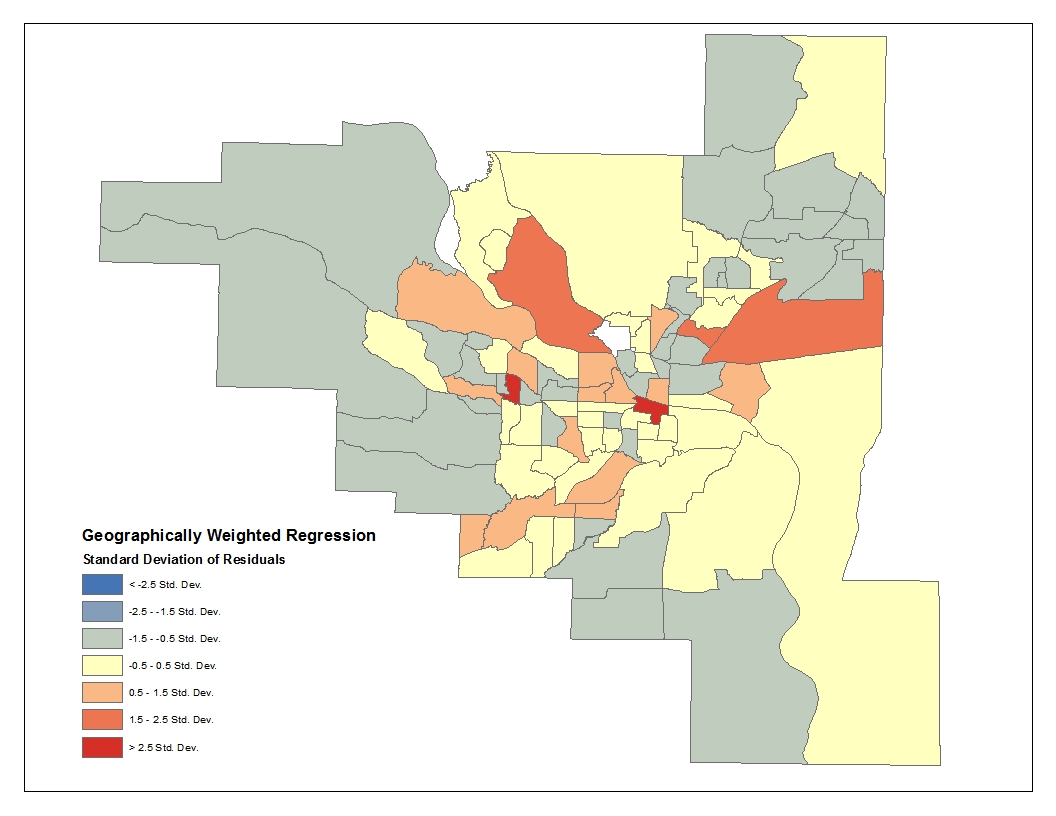
All the maps are visually unexciting. I could have tarted them up a little but not much. The first three contain information that is mildly interesting but look at that last one. What the hell is geographically weighted regression? That is a really esoteric map that’s not super useful even to someone who knows what GWR is.
The upshot of all this is that the statistical analysis showed that while alcohol-license locations in Pulaski county are spatially autocorrelated (they are not randomly dispersed), the reason for the spatial autocorrelation is not median household income. Unless you know your way around spatial statistics you’ll just have to take my word for it. You can read the paper I wrote for the class and get a slightly more technical explanation.
If you like maps I urge you check out the Bostonography post. The map there looks much, much better than mine. It doesn’t hurt that Boston is much denser than Little Rock and much more populous.
Comments
Great maps and analysis. The GWR is neato. I’ve never heard of that. And the varibles for it are income and license location?
Author
Yes, those are the variables. And GWR isn’t the only stat. There’s an ordinary least squares regression that’s similar to GWR but the geography isn’t taken into account and the Moran’s Index, which shows the extent of spatial autocorrelation.